

The job of a solution architect is to clearly communicate the design of software systems to business, project managers and developers. As we found out earlier, you can not just draw a single image. This is nor possible, neither useful for anybody. So instead you cover different concerns, grouped by view points and create a set of diagrams describing each view. Of course, there is a billion of ways you can do it. How to pick one up?
During my work as Solution Architect I use 5 diagrams the most: C4 Context and Container diagrams, Deployment Diagram, Sequence diagram and Use Case diagram. Let's go through them.
Context

The c4 website does a pretty good job explaining their diagrams, but I still would like to provide my own understanding.
Your system operates in some context. Primarily, it's their users and other software systems. Users may have different roles like content creator, reader, administrator. Also they can be internal or external. Other software systems may be source of data for your system, or get the information from it. It is important to understand this context to properly design the system and remind yourself to integrate with external systems.
Example
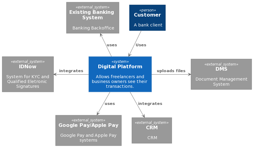
This diagram displays the neo-banking digital platform presented by a blue rectangle in the center.
How to draw
- Identify the persons who will use your system
- Identify the external systems
- Create a single rectangle depicting your system
- Add connections between the system, users and external systems
- Provide meaningful comments on every component
Tools
There are different tools you can use to create the context diagram. There are C4 stencils for OmniGraffle, C4 examples for LucidChart, draw.io has the stencils as well. You can also use PlantUML to leverage diagrams as code. Let's say we want to draw the aforementioned diagram for a neo-banking digital platform with uml:
@startuml
!includeurl https://raw.githubusercontent.com/RicardoNiepel/C4-PlantUML/master/C4_Context.puml
' uncomment the following line and comment the first to use locally
' !include C4_Context.puml


Person(customer, "Customer", "A bank client")
System(abc_system, "Digital Platform", "Allows freelancers and business owners see their transactions.")

System_Ext(idnow, "IDNow", "System for KYC and Qualified Eletronic Signatures")
System_Ext(pay, "Google Pay/Apple Pay", "Google Pay and Apple Pay systems")
System_Ext(dms, "DMS", "Document Management System")
System_Ext(crm, "CRM", "CRM")
System_Ext(current, "Existing Banking System", "Banking Backoffice")

Rel(abc_system, pay, "uses")
Rel(customer, abc_system, "Uses")


Rel_L(abc_system, idnow, "integrates")
Rel_Neighbor(abc_system, dms, "uploads files")
Rel_D(abc_system, crm, "integrates")
Rel_U(abc_system, current, "uses")

@enduml
We define a person, a system, external systems and the relations between them. Person, System and System_ext predicates have 3 parameters: a key, a title and a description. Rel predicate has 3 parameters as well, but they are different: a key of one entity, a key of another and a name of the relation.
Basically you can draw a context diagram in any drawing tool you'd like. Several great examples can be found here.
Important highlights
- Context diagram is the first thing you create when working on a system. Failing to do so may cost you missed integrations and mistakes during system design.
- Context may actually include some lower level details, this is perfectly fine.
I was struggling with a context diagram for one banking system. It would include only a newly created system and a single customer, which didn't bring any value. After the reconcideration I added an API Gateway and an existing Auth Provider we were going to use. That way the context diagram started to make sense and allowed to omit those elements from the lower level diagrams.
- Aleksey, Solution Architect.
We had a learning system in development. At the time of Alpha release we understood, that analytical system is not receiving the data from the client facing app. Should we have a context diagram in place, we won't make that mistake. Luckily, it was easy to fix.
- John, Solution Architect.
Summary.
Context diagram is a crucial view which provides the highest level understanding on the people and systems your future system will interact with.
Containers

Containers don't mean docker containers here. Container is an any deployable entity or data storage from the C4 perspective. It can be a mobile application, a website, a VM, a docker container, a database or an object storage; whatever you can deploy. In my experience this diagram is the most complex and it gains the most attention in the same time. That mean it is almost the main diagram you have to work on!
The trick here is you are zooming in into your system. What was a single rectangle, now consists of some rectangles and arrows. Those rectangles are containers now.
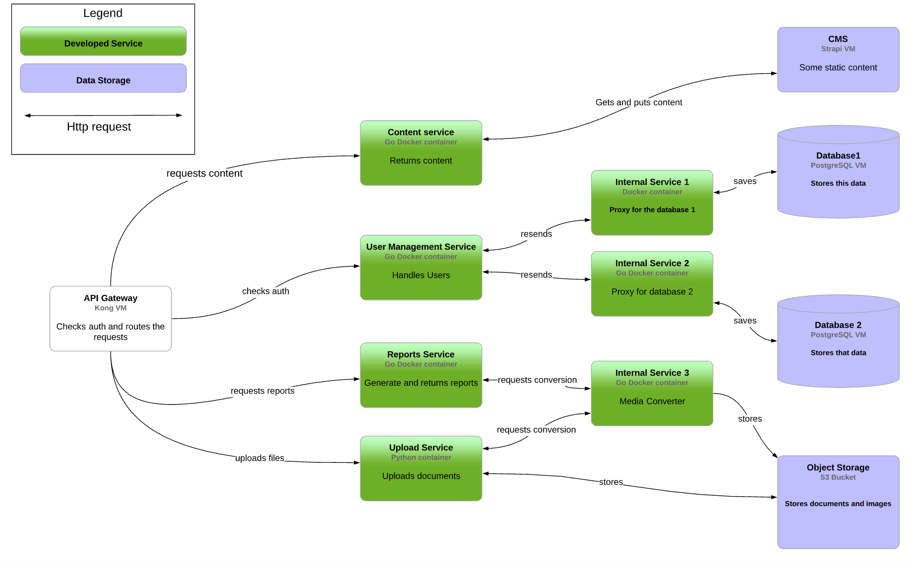
Example
How to draw
- Identify the list of entities: microservices, storages, external services
- Place them on the diagram
- Add comments on the purpose of each component and the technology it is implemented with
- Add connections with arrows
- Add meaningful labels to each arrow
- Pick up a color scheme and apply it
- Create a legend.
Tools
Same as for the context diagram: Draw.io, OmniGraffle, LucidChart and others.
Important highlights
- Pay attention that the elements are placed in columns. First column is just an API Gateway, the second - the first group of services, then a second group of services, then some storages. This way you demonstrate the layered architecture, which helps to understand the boundaries and responsibilities.
- When microservices count grows beyong a single digit, your connection lines will start to intercept. The academical books say you have to avoid the interceptions for readability. Unfortunately, this is not always possible. Do not get upset: focus on making the diagram readable. You can use different colors or line widths, or different line styles(dotted, solid, etc.)
- If you use a custom tool(like I am) you need to include a Legend block. It's not obvious what the arrows mean, and what is the color's meaning. Legend explains it.
- The common question when using cloud is: do you include the managed services, like queues and messaging solutions? I tend to answer no. This complicates the diagram instead of making it easier to read. If some services are communicating through a message queue, display it via separate type of arrow.
I teach my fellow architects to follow the layered approach when they create container or components-and-connections diagrams. Those diagrams tend to include many entities and structuring them with layers increases readability.
- Ilya, Enterprise Architect.
Summary
Container diagram provides insight into which deployable items your backend consist of and how those components talk to each other.
Sequence Diagram

The first two diagrams show how the elements of the system relate to each other. However, they can not demonstrate what happens in your system. For example, a user sign ups for your system. Which components are involved? What actions are triggered? How the components interact with each other? Sequence diagram can answer these questions.
Example.
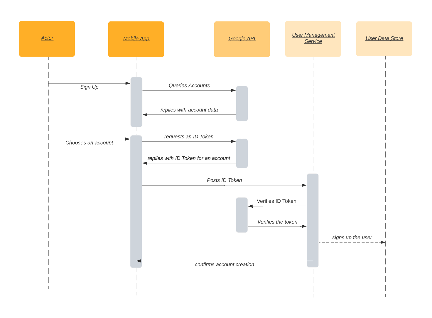
At the top we see interacting entities: persons, web and mobile applications, external systems, services and data stores. Each entity has a vertical line underneath. The interaction between services is notated with horizontal arrows between the vertical lines. Those arrows can be of different types depending on whether this is a synchrornous operation or an asynchronous. The grey rectangles shows that process is taking some time and the length should indicate the duration: the longer the rectangle, the longer the time.
How to draw
- Choose a business case(a user sign-in, a purchase, etc.)
- Identify the entities involved in the use case
- Put them on the diagram
- Add interactions(arrows)
- Provide valuable comments to each arrow
Tools
Unfortunately, OmniGraffle is not suitable for sequence diagrams. Therefore I use draw.io and LucidChart for drawing them. The latter is a good choice because you can choose either to draw the diagram manually or use the UML Sequence diagramming. This is possible as Sequence Diagram is a structured one.
Important highlights
- Sequence diagram is an absolute must when designing a new feature you add to the system. It shows the affected parts of the system, points of integrations with external software and contracts which the team will have to create or update.
- Sequence diagram is valuable for QA engineers as well. It provides the insights where the potential issues can be located and serve as a source of truth for Test Cases.
Few months in a project, and we still faced the issues when the parts of the system were not ready for a long awaited feature. Stakeholders were not happy at all, and there was a traction between different teams. We discussed the issue and agreed to make architecture design before the imlementation. Sequence diagrams were a great help: now we know the full picture before writing the code, not after.
Vladimir, Solution Architect
Summary
Sequence diagrams allow to document the behavior of the system in different business cases.
Deployment Diagram

Using context, containers and sequence diagrams you can answer what parts of the system consist of and how they relate and interact with each others. But they hardly can answer the questions of availability, scalability and security. Deployment diagram helps with that.
There are several different things you want to display.
Compute resources. This can include virtual machines, docker containers, kubernetes clusters and cloud functions. You can also think of mobile devices and desktop computers as compute resources as well.
Storages. Persistent storages for your data like relational and nosql databases, binary file storages like images, music and video, bigdata storages with parket files and so on.
Messaging resources. Kafka/RabbitMQ installations, Google Cloud pub/sub, AWS SQS and others.
Networks. Your computers use networks to communicate with each others. Both physical and virtual networks should be displayed.
Availability Zones. You can think of them as data centers.
Infrastructure Nodes. DNS servers, Load Balancers, Firewalls, CDNs
The diagram shows the compute, storage and messaging resources alongside with networks and availability zones. It also includes the instrastructure nodes which are not fulfilling any functional requirements, but addressing non-functional instead.
How to draw
- Place the major building blocks: browsers, mobile devices, public cloud, data centers
- Place the computing and storage resources
- Add infrastructure nodes
- Add networks
- Add the network calls between nodes
- Add the monitoring resources
- Add scalability comments if required
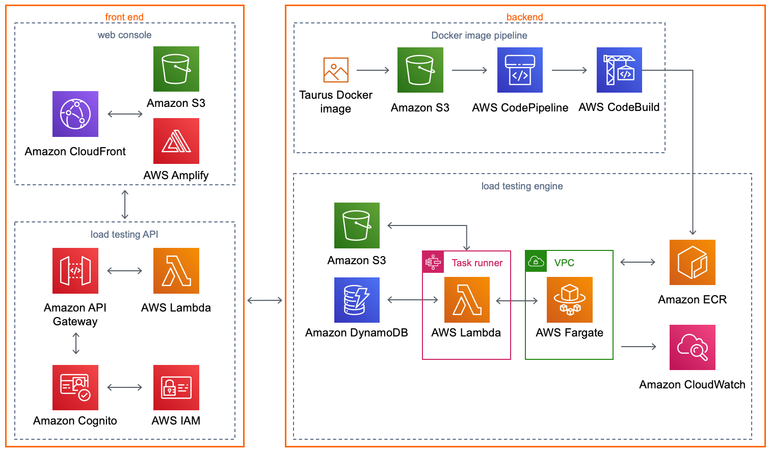
Example
C4 notation has a supplementarty deployment diagram:
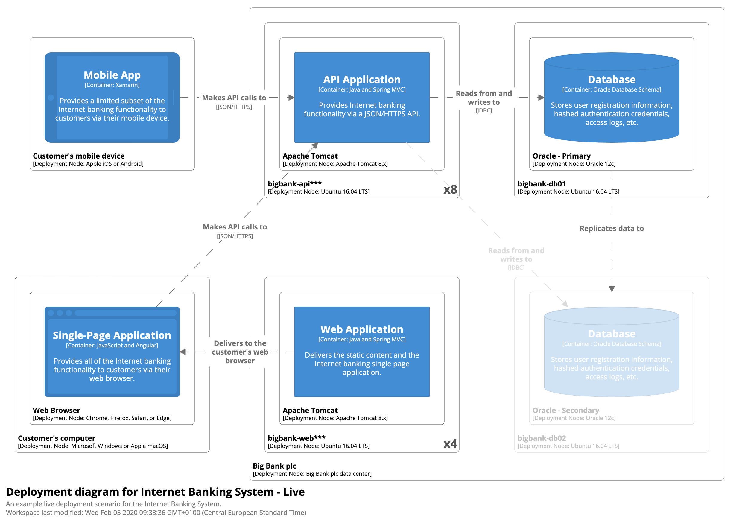
Mind the names of the compute resources, their types and node numbers.
Another example for AWS cloud:
Tools
There are plenty of tools to create a deployment diagram. OmniGraffle, LucidChart, Draw.io and others are perfectly capable of doing so with proper stensils installed.
Important Highlights
- Every system has the requirements on security, performance, availability and other -ilities. Deployment diagram helps to address those requirements.
- In most cases deployment diagram is the only one depicting the network aspects of your solution.
- Deployment diagram should show how the requests are going through the system in a clear, understandable way.
Summary
Deployment diagram complements the understanding of the system from the physical appearence perspective.
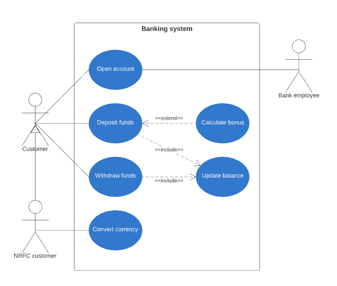
Use Case Diagram
The most of previous diagrams were very technical ones. Use Case diagram is more business oriented. It depicts how the persons are interacting with your system in a very high level way. Use cases themselves can be treated as business capabilities, which I were describing in this article.
How to draw
- Draw a rectange. This will be our System boundary
- Define which persons your system is dealing with
- Add use cases inside the system using ovals
- Add connections between the actors and use cases
Example
Tools
The architect can draw a diagram with any graphical editor and with the same toolset used for other diagrams. Omnigraffle, LucidChart, Draw.io are working well. Remember, that Use Case Diagram is a structured once so you can use UML for creating it. PlantUml or LucidChart helps with that.
Summary
- Use context diagram to show the highest level view on the system
- Document the use cases with the corresponding diagram
- Zoom on the system internals with containers and deployment diagrams
- Document particular business cases with sequence diagrams
Discuss this article on twitter.
If you like the article, make sure to Subscribe for the upcoming articles!